How I learned to stop worrying and just paint.
Welcome to part 2 of my four part series all about my work on Kevin Smith’s, Tusk! If you didn’t catch part 1, you can totally catch yourself up before proceeding here.
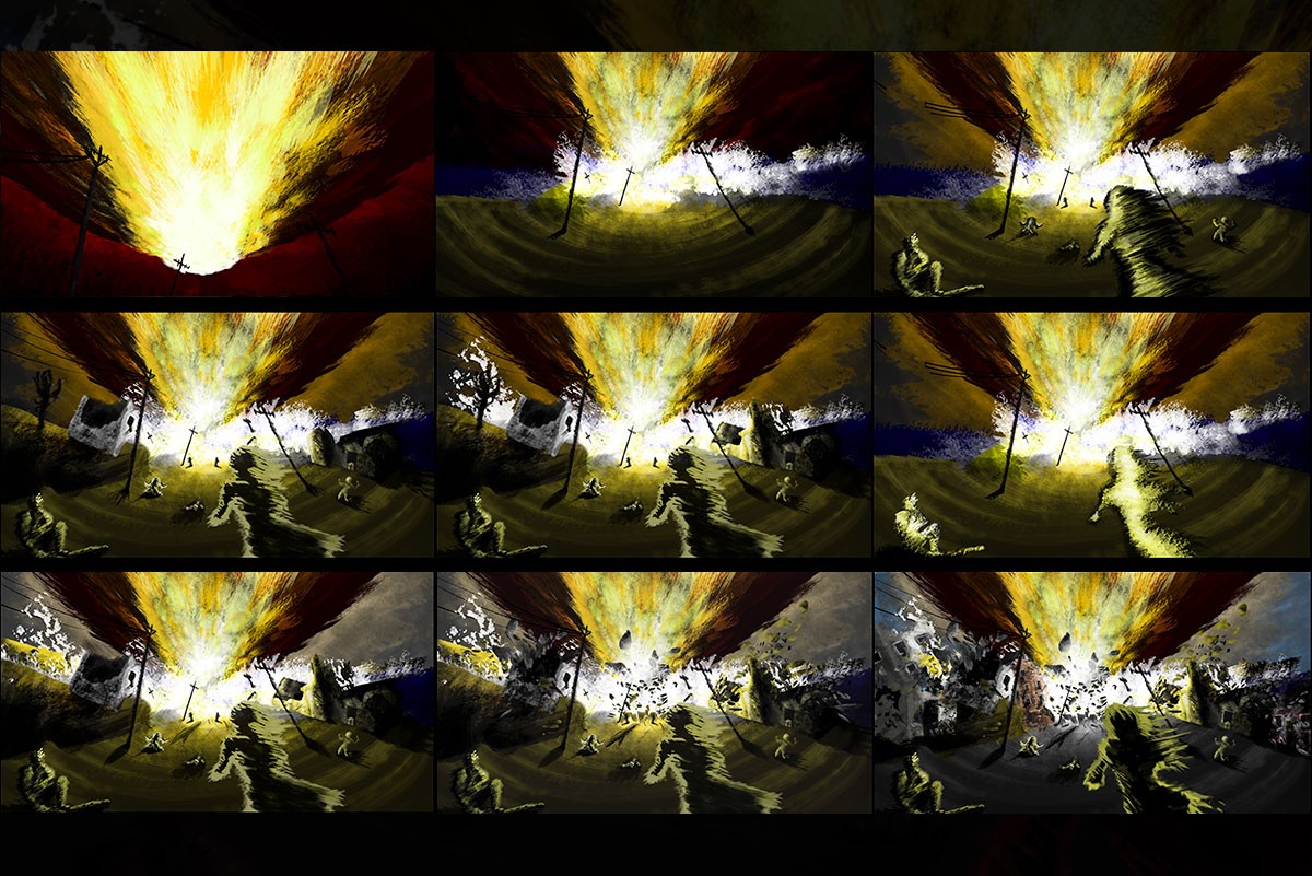
For take two, I decided that photos were not the answer and I was going to have to actually paint this thing. Working from the notes that the piece needed to be more abstract, I downloaded an oil brush and palette knife brush set for Photoshop, and created the following ghostly images using the sketch as a reference. While getting closer to our final goal, these pieces were still not QUITE there.

Recognizing the problem, Ken explained that the figures needed to be revealed by the light created by the blast, and sent along the following comic panels from The Incredible Hulk #1, showing Bruce Banner getting hit by the blast of gamma radiation that would transform him into the famed green super hero. He also sent along examples of pointillism and impressionism, to make it feel more abstract in a classical way.

With the new direction in hand, I read a variety of articles on traditional oil painting techniques and found some real-world oil paint pallets to sample for colors. Becoming burnt out on the figures, I elected to try my hand at creating the actual explosion. This was my first breakthrough.

Using the technique of starting with the dark colors and brightening as I went, I created the center piece of the entire painting, and the source of the light that would reveal the figures, the explosion. Once I received the go ahead from Ken on the look of the blast itself, and the telephone poles it was destroying, it was time to tackle our characters again. Using the previous figures as a base, I applied what I’d learned creating the explosion, and the look of the center panel from the reference comic to create the following image.

Finally, I got approval for the look of the figures themselves. What followed was painting layer by layer in a massive 5+ gig Photoshop file that forced me to double my RAM from 8 to 16 gigs. Once I got the look of the explosion down and had a few people in my scene, I started adding in the ground and terrain details, the ocean, waves, sky, and the silhouette of the Imo being pushed away by the blast, before ending up on Dartmouth’s shore. Each object was painted on individual layers in photoshop to make the animation step easier, saving the process of cutting and cloning out objects in the comp later. The only downside to this was the massive file size, which was significantly decreased once I removed a bunch of backup layers.


From here, I added in a few more background details, including the pavement (we had dirt previously), as we discovered the roads would have been paved at that point in time. I also threw in some more people and debris being thrown up by the explosion. To get a good sense of how chunks of pavement would be thrown up into the air, I created a few solid layers in After Effects and applied the shatter effect with varying degrees of gravity and different shaped pieces. Once I had a look I was happy with, I output a few variations to Photoshop as high-res PNGs, and started painting over the pieces. Mixed in with the chunks of rock, are little human beings. I used images of people sky diving, and photos from September 11th as a reference to create the look of the people, and debris, falling through the sky . It was an emotional afternoon, but I think the end result was worth it. This all culminated in what I thought was the final draft (last frame above). Ken thought there just wasn’t enough in the piece to identify it as a busy port street, so I created more buildings and debris sprawling out from the seaside toward the viewer to get the following.

Once all the details were added, we started experimenting with the strokes on the figures in hazy yellow. After a few variations, Ken decided the color just wasn’t working and recommended the final red color. Along with more clearly defining the figurers from the environment, the black/red combination also served to communicate an emotional tone, giving the composition more of a despondent feeling, and tying everything together thematically.

After finalizing the details of the painting itself, we discovered that our painting was on a 16:9 canvas. While common to HDTVs, which are uncommon in 1917 it turns out, 16:9 is not an aspect ratio that you normally see when it comes to oil paintings, which are normally 5:6. This meant simply that our composition had to be resized to the aspect above before sending along the file to CanvasOnDemand for printing.
Up next! The file is sent to the printer and we get a bunch of paintings back in the mail! See what happens when we experiment with giving this silky smooth digital painting some real-world texture.
Special thanks to Ken Plume for pulling my name from his Rolodex when they needed somebody to make a painting and make it move.
Comments are closed